UI Design for LiquorLand Sales Proposal
Project Details
Olympic Software had the chance to pitch for a job to upscale LiquorLand's eCommerce platform. I worked with the sales consultant and software team lead to create design concepts of how this new experience could look, fitting in with the sales pitch and Liquorland's requirements.
Design Process
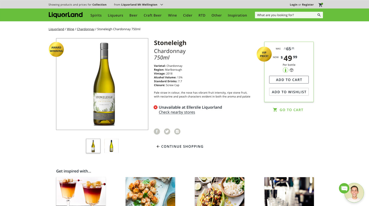
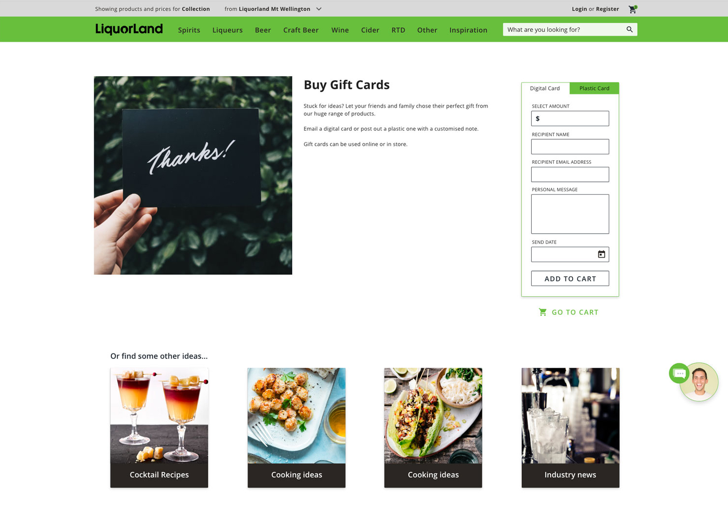
I wanted to modernise the LiquorLand site, aligning with the brand's colour and style of the physical stores. One of the main objectives was creating a spacious layout while incorporating a lot of information for shoppers. Particularly on the product page, where we included store stock levels, recipe inspiration and purchasing options so that the user could get everything they needed to recreate the feeling of shopping instore.
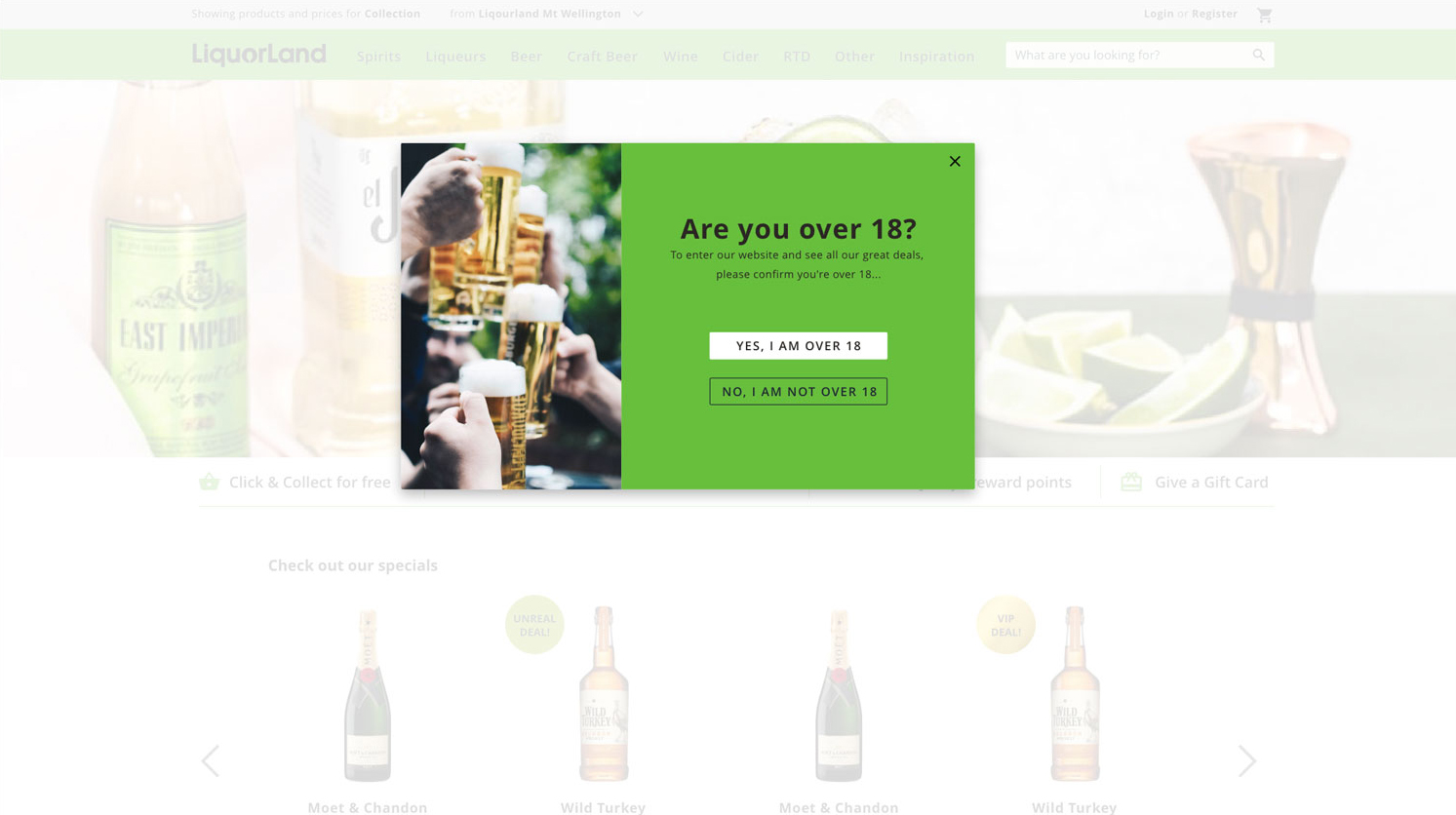
On the homepage, prominence is given to space for marketing banners and CTAs to lead customers into the site.

