UI Design for DX2 Digital Exchange Software
DX2 UI Design
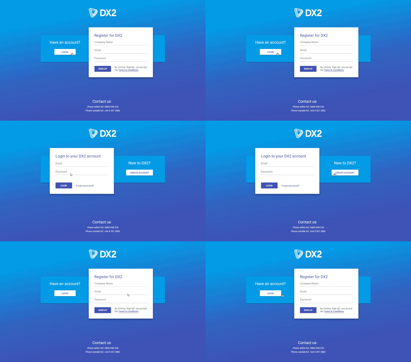
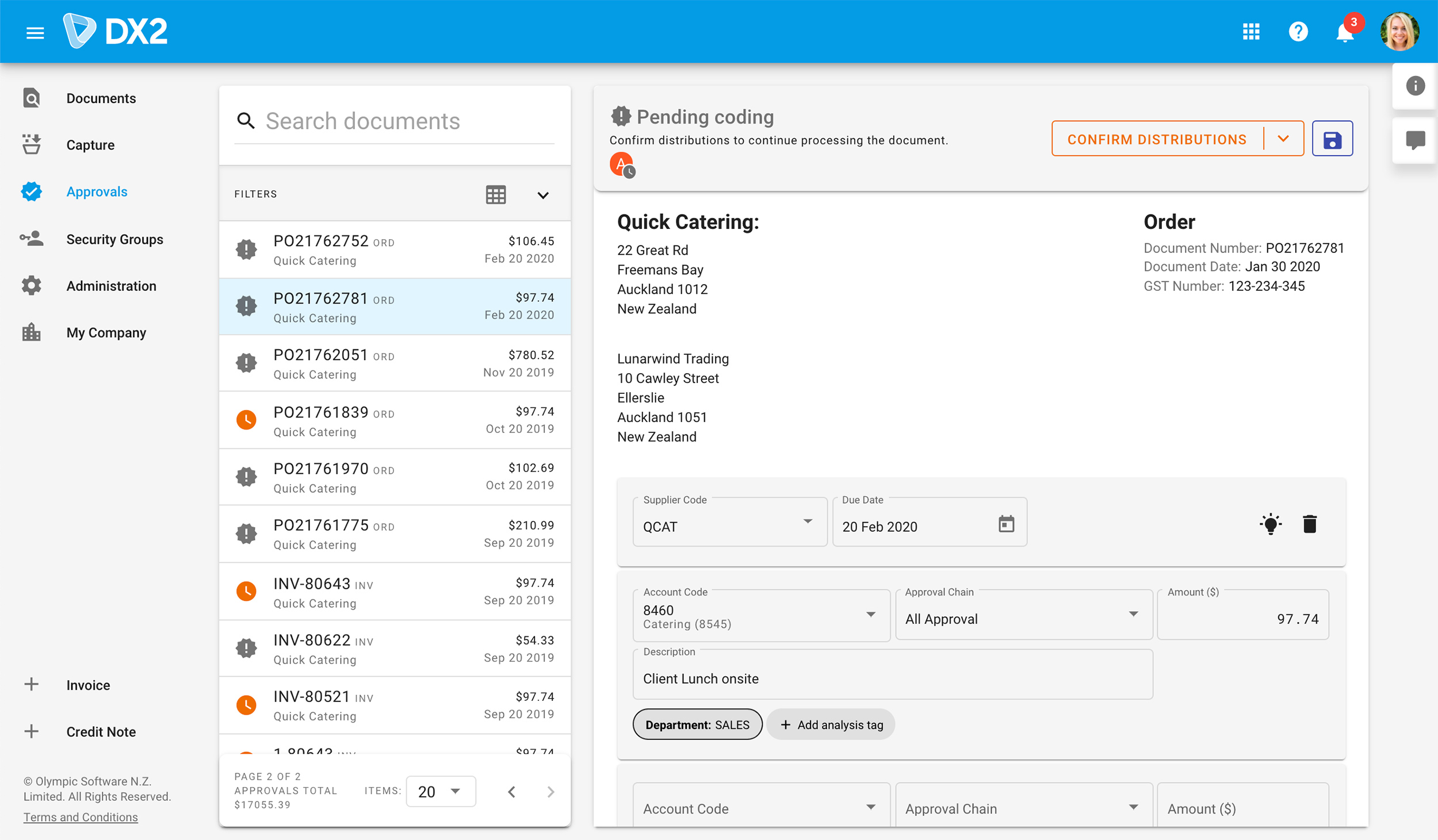
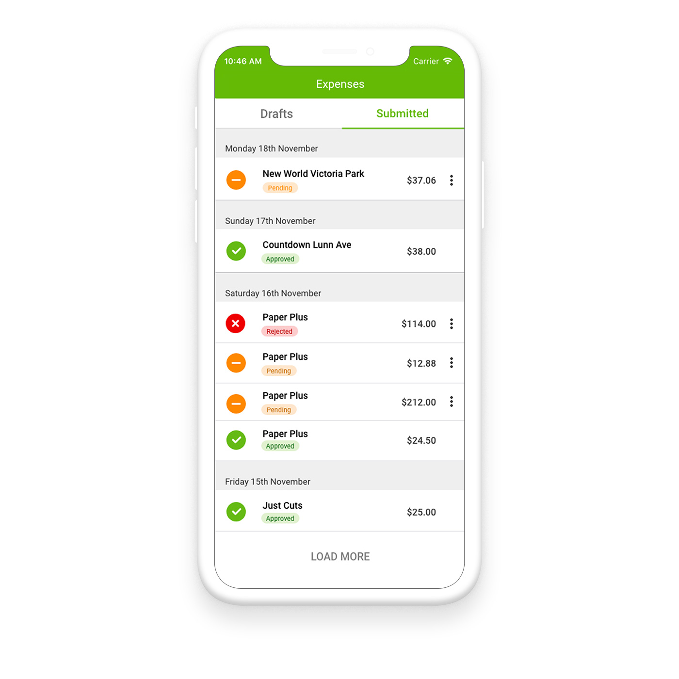
The DX2 software application has been my main project at Olympic Software. Working closely with a team of developers, the Lead UI Developer and the Product Owner, we took an old, out-of-date interface and created a modern, user friendly application.
Design System
We decided to use Google's Material Design system, so that the interface would feel natural to many users, and it makes implementation easier for developers to have a set of guidelines in place for the user interface.
Responsibilities
I am in charge of maintaining a consistent UI across the solution, so that users find it familiar and easy to use.
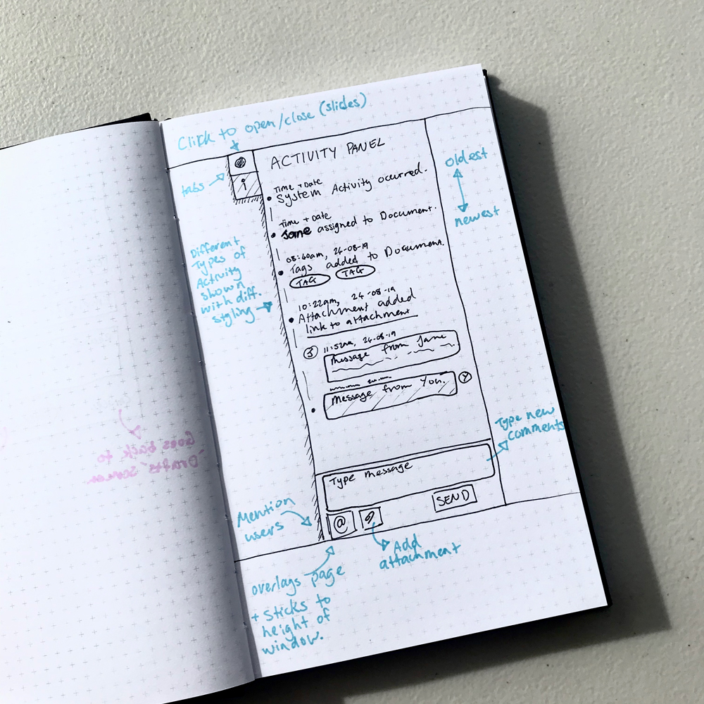
I work with the Product Owner, sales team and development team to create a user journey that achieves the goal, drawing wireframes, then creating high fidelity prototypes in Adobe XD. I then present the ideas to the stakeholders and work with them to make sure it fits their requirements, before the developers create the product, assisting to ensure they understand requirements and to work around any technicial limitations that may arise.
Issues Faced
Some areas of the DX2 UI were being re-created in the new design, so there was sometimes a preconvieved idea of how the product should work. We had to find the right balance of improving the UI, while maintaining enough familiarity for those who had previously used it.
Parts of the DX2 web app were developed according to client requests, which meant that they needed to be developed in a short timeframe. Using Adobe XD we were able to create and iterate over prototypes very quickly to fulfil the demands of the business.
